

Images: Chris and Malissa Tack
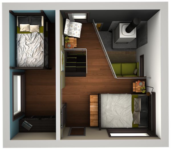
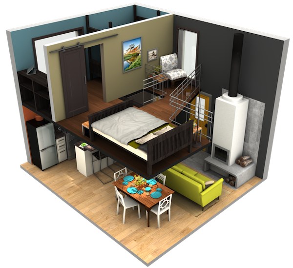
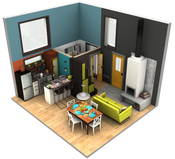
The dimensions are approximately 18′ x 15′ so it has just a 270 sq. ft. footprint and of course more living space than that because of the upstairs loft. More info and pics are available here.
If you enjoyed this tiny/small house 3d design, you’ll love our free daily tiny house newsletter with more!

Loft? I don’t think so. It’s a 2 story house more like 450sq’ . Very nice though.
Impressive in design and layout. Would have enjoyed seeing bathroom detail, but I appreciate the design tool, was it CAD?
Very nice design.
Jerryd, Please note Alex said the footprint was 270 sq ft, not the whole house.
Greg, CAD is computer aided design. Creates great images you can manipulate however you like. Very cool tool once you master it.
Great choice Alex
Truly inspiring use of space, I like that its not all designed as one color of wood like so many of the tiny houses I’ve seen. I had been trying to picture how one could look designed more like a traditional house as far as cabinetry, paint, etc goes. You have given me a great mental picture to work from. Thank you for your efforts.
Ralph Sly, aka Running Bare, I LOVE your comments. You sound down to earth and right on with your comments. I won’t try to comment on the fire, as I’m more into a simple clean unit (if you have gas or electricity available, seems like to heat and cool (I’m from the south) a unit like this, you would only need one small hotel type unit with no mess, but it won’t function off the grid, although this doesn’t appear to be very OFF of any grid. There are more pictures on the link (I think it is above) but as one person said, this really is a 2-story house. You do need closets and I highly recommend the bath be on the second floor, but this is not a deal breaker for me. It is right at the bottom of the stairs and I don’t need to get up 12 times a night, (like some other people I live with!)
The kitchen DOES look like it functions really well. Some of the other pictures showing more of this design (the link) show 2 sets of french doors and 2 single doors (all exterior doors) on this plan. # 1, WHY do you need 6 doors in this size home? and WHY is so much space dedicated to eating rather than lounging? That was my biggest issue with this layout. # 2 – No closets. The “presentation” is VERY nice, just impractical for actual LIVING. I seriously see this design as just that, a design. Maybe it was for a competition, and hopefully the comments here will help the person who designed it to think through the lack of storage. EVERYONE has stuff that needs a home to live in. This would be like staying in a hotel. All your toiletries would be on the counter in your overnight case, all your phone chargers would be laying all over the counters. No desk area for your compy… This would be like a over-nit visiting place, not a living full time place. BUT it LOOKS incredible and IF the designer would add closets and some built-in storage (rather than using all free-standing furniture) it could be AMAZING!
I design homes for a living and have recently gotten on a tiny house kick. Maybe I’ll start blogging some of my plans to give people ideas. Who knows….. Recently I saw a “Double Drop Deck” flat bed (semi truck) trailer for sale. It was AMAZING. It had about 45′ of length (on 3 different levels) and 8.5′ wide. That’s 360 sq.ft. of tiny house! Just imagine what could be done there! I have already come to the conclusion, that even though I hate a single pitched roof (the contemporary look), it really allows for more options with windows and lofts over a traditionally gable/pitched on 2 sides roof. So, I need to get off my bum and start sharing some of these ideas. This could be fun!
The large window in the 2nd Br could be put at the other end rather than have what I believe is a dresser there, it could be a huge closet or two small ones to service both rooms. I would also reconsider the sitting area in the main bedroom (looks more like a pouting station to me), ditch the window and put in a closet. Rack and stack people but everyone has clothing which require hanging unless this place is designed for a nudist retreat, then hey, call me “Running Bare” however, with the ridiculously overkill heat source (too much bulk for my liking) I doubt this small house is planned for 365 day warm or moderate temperatures climate to entertain such activities in the great outdoors. Indoors, it may have some significance. I appreciate these concepts for the stairway to the play pen but again, the taller part could be for entering, disrobe and disposal of jackets and footwear. Yep. It would have been nice to see the bathroom ideas, is there not a way to make any of these walls transparent or just show the framing of portions in the CAD? The kitchen is a defining winner! I love it.
With this design, I think I would have gone two full stories (packing a hell of a lot more into 540’), put the main bath in the upper level and a half bath on the lower. I feel the right idea was entered into then not enough thought to total comfort and convenience of a compact nature. However with that said, the open area between levels is nice but really only works as eye candy which could be achieved through many other means. Serious lack of consideration of closet or storage space takes a major drop in my like scale. It would also be nice when one displays a concept they include an exterior so we can see the roof lines for ways to incorporate water collection, solar or other whistles and bells.
These wood burning stoves are great but cause unnecessary mess with everyday use. I like the idea of resupplying fuel (logs) from the outside directly to interior storage. If outside sheltered storage attached to the building provides a one action handling station. Stack it there, open a little door and put the wood directly in there and you save handling, tramping it through the door and restacking which eliminates floor mess and cooling the house by running outside, possibly many times to bring in fuel.
That is about it for me, once again, short, sweet, with consideration of those of us slightly pudgy, getting feeble (always extremely cute) and older. My suggestions would not add a lot to this place cost wise and figure they would add so much more convenience, safety and comfort but not a bad pick all considered Alex however I am only half way there with really like. (did I mention I love the kitchen) As usual, being somewhat vague but then again, what the hell do I know?
Nice! Really great way to visualize ideas! I’d love to know what tool was used to make the drawings … Pondering over said drawings, I’d probably also add a second “half bath” directly over the first to take advantage of the plumbing directly above/below, and shift the smaller bed to the other end of the space, or even make it a “fold down” somehow … But, great job!
Where do those that sleep in that bigger bed put their clothes? I see the bunks have dressers but nothing for the big bed.
I’d definitely consider a design like this. I really love the loft design. I would use that smaller extra bedroom as a library/writing nook. Really good design here!
I actually love it and I am not really a fan of stairs but, would love to have this sweet little set up/space.
Having to pass through the Master to get to the 2nd bedroom is kind of awkward, esp. for middle-of-the-night bathroom trips. Other than that, I like it a lot!
Nice design! I agree about the bathroom, though. I live in a log cabin, the bed is in the loft and there is not bath up there. Middle-age has crept in and a 4am run to the bathroom is common – and, yes, I have fallen. I would say an upper bath – even a WC – is necessary. One more note – I suspect the house would have to be built around the bunk beds because I can’t see how those beds got into that room. Just saying. Great little house!
I love the set-up for this small home but it seems to lack closet space.
Is there any closet space for at least the master? Where would, even a modicum of clothes, shoes and outerwear be stored?